Graphing and Visualization
MacroTrace provides comprehensive visualization capabilities through the MTTimeSeriesPlotter class, accessible via the .plot property on any MTTimeSeries instance.
Overview
All plotting in MacroTrace uses Plotly for interactive visualizations. The plotting interface is designed to help you:
- Visualize time series data and vintages
- Analyze revisions over time
- Compare different vintage releases
- Assess revision quality and patterns
Quick Start
from macrotrace import MTTimeSeries

# Load a time series
ts = MTTimeSeries(
    dataset_id="PAYEMS",
    source="fred",
    data_start_date="2022-01-01",
    data_end_date="2025-12-31",
)

# Create a simple time series plot
timeseries_fig = ts.plot.timeseries()
timeseries_fig.show()
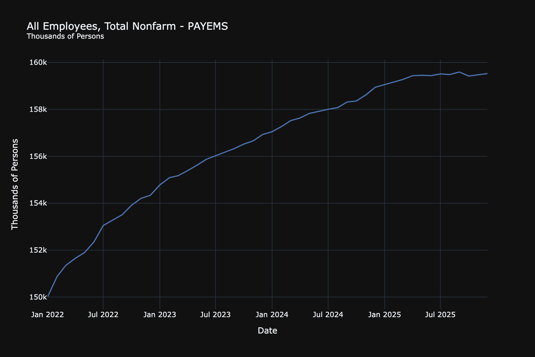
Available Plot Types
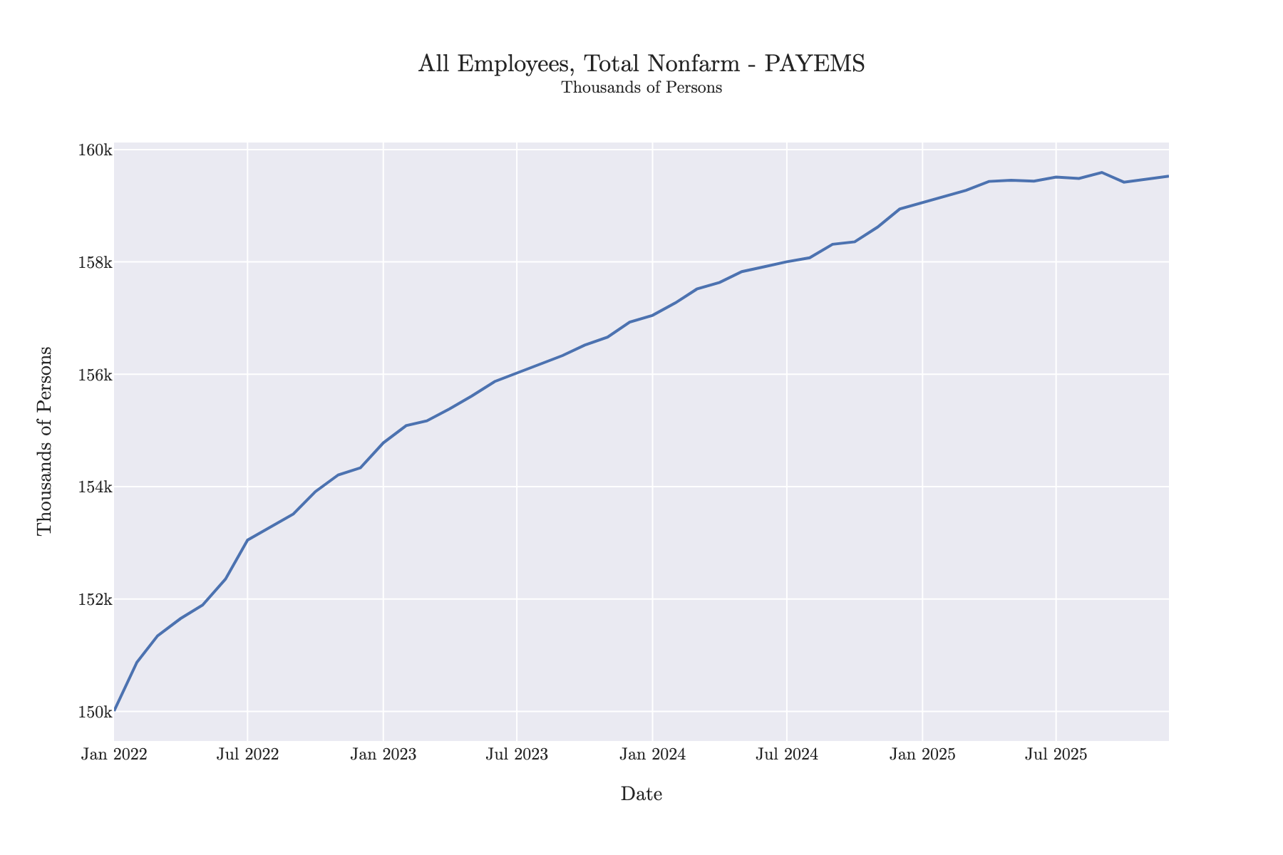
Time Series Plot
Plot the current vintage of your time series:
# Basic time series
timeseries_fig = ts.plot.timeseries()
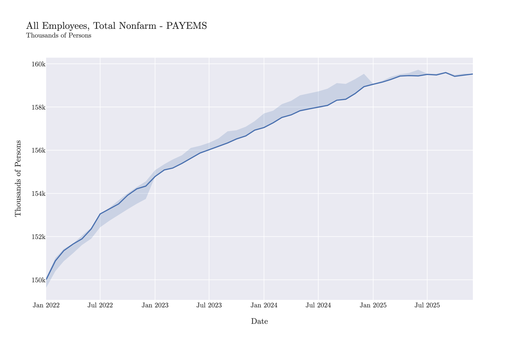
# With vintage range bands (shows min/max across all vintages)
timeseries_with_range_bands = ts.plot.timeseries(show_vintage_range=True)
timeseries_with_range_bands.show()
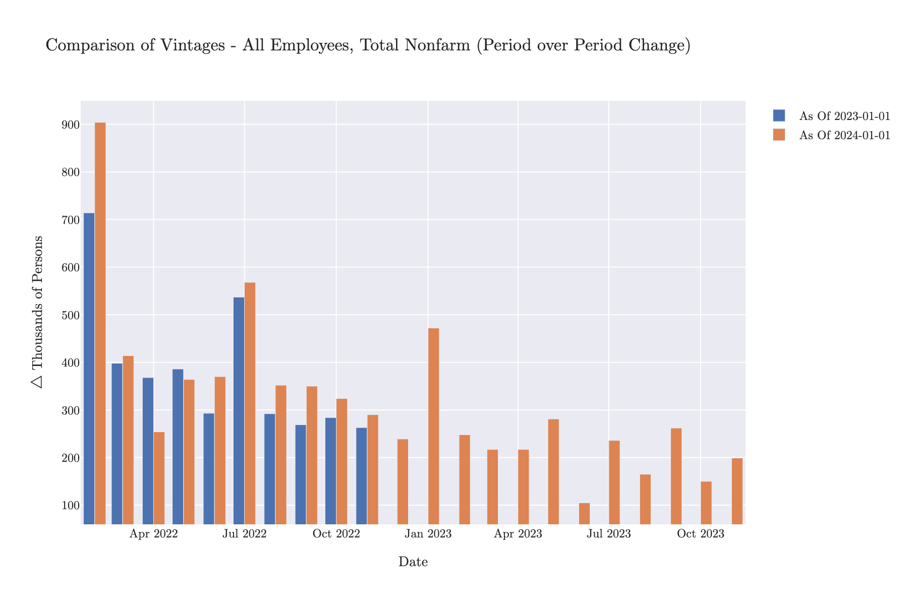
Vintage Comparison
Compare multiple vintage releases side-by-side:
# Compare three different vintages
timeseries_comparison_fig = ts.plot.timeseries_comparison(
    vintage_dates=["2023-01-01", "2023-06-01", "2024-01-01"], chart_type="line"
)

# Compare with first differences
timeseries_comparison_diff_fig = ts.plot.timeseries_comparison(
    vintage_dates=["2023-01-01", "2024-01-01"],
    mode="first_difference",
    chart_type="bar",
)
timeseries_comparison_diff_fig.show()
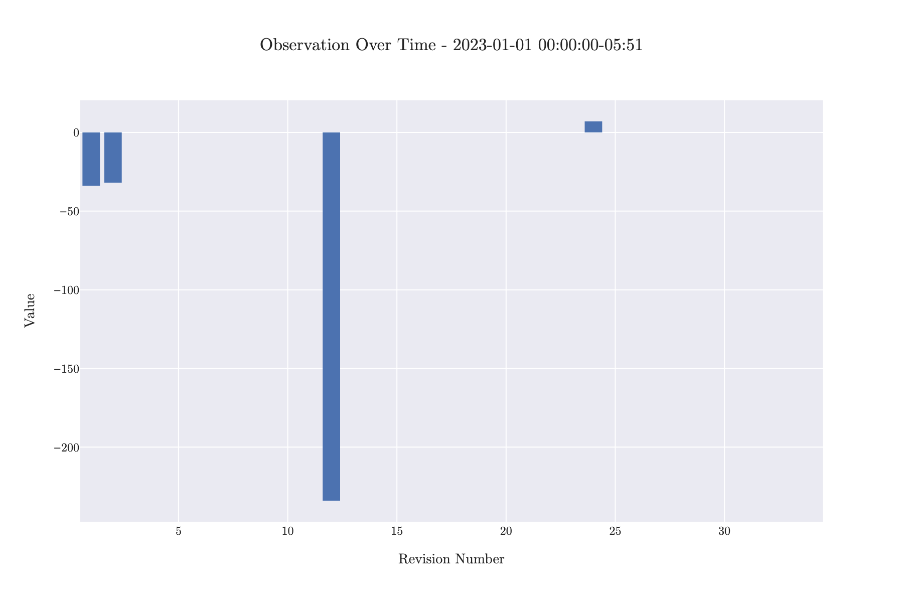
Observation Over Time
Track how a specific observation evolved across revisions:
# See how Jan 2023 payroll data was revised
observation_over_time_fig = ts.plot.observation_over_time(
    observation_datetime="2023-01-01", chart_type="line"
)

# Show first differences (revisions)
observation_over_time_diff_fig = ts.plot.observation_over_time(
    observation_datetime="2023-01-01", first_difference=True
)
observation_over_time_diff_fig.show()
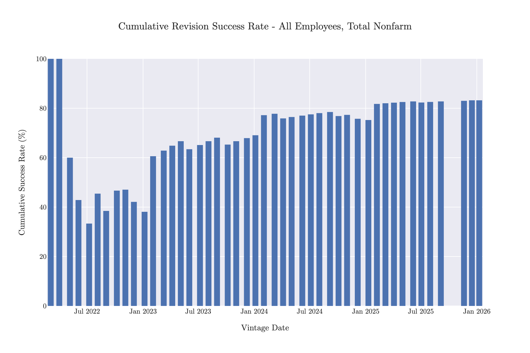
Revision Analysis
Analyze the quality and patterns of revisions:
# Revision histogram
revision_histogram = ts.plot.revision_histogram(mode="first_difference")

# Revision success rate over time
revision_success_fig = ts.plot.revision_success(chart_type="line")

# Bar chart without showing overall rate
revision_success_fig_bar = ts.plot.revision_success(
    chart_type="bar", show_overall_rate=False
)
revision_success_fig_bar.show()
Customization
Chart Types
Many plotting methods support different chart types:
chart_type='line'- Line charts (default for most)chart_type='bar'- Bar charts
# Line chart
fig = ts.plot.observation_over_time(
    observation_datetime='2023-01-01',
    chart_type='line'
)

# Bar chart
fig = ts.plot.observation_over_time(
    observation_datetime='2023-01-01',
    chart_type='bar'
)
Display Modes
For vintage comparisons, you can choose different display modes:
mode='default'- Show raw valuesmode='first_difference'- Show period-over-period changesmode='pct_change'- Show percentage changes
fig = ts.plot.timeseries_comparison(
    vintage_dates=['2023-01-01', '2024-01-01'],
    mode='pct_change'
)
MacroTrace Template
All plots use the MACROTRACE_PLOTLY_LAYOUT_TEMPLATE for consistent styling. The template is automatically applied to all plots. To customize, modify the layout after creating the figure:
Exporting Figures
You can export Plotly figures to static images or HTML files: